Note
Go to the end to download the full example code.
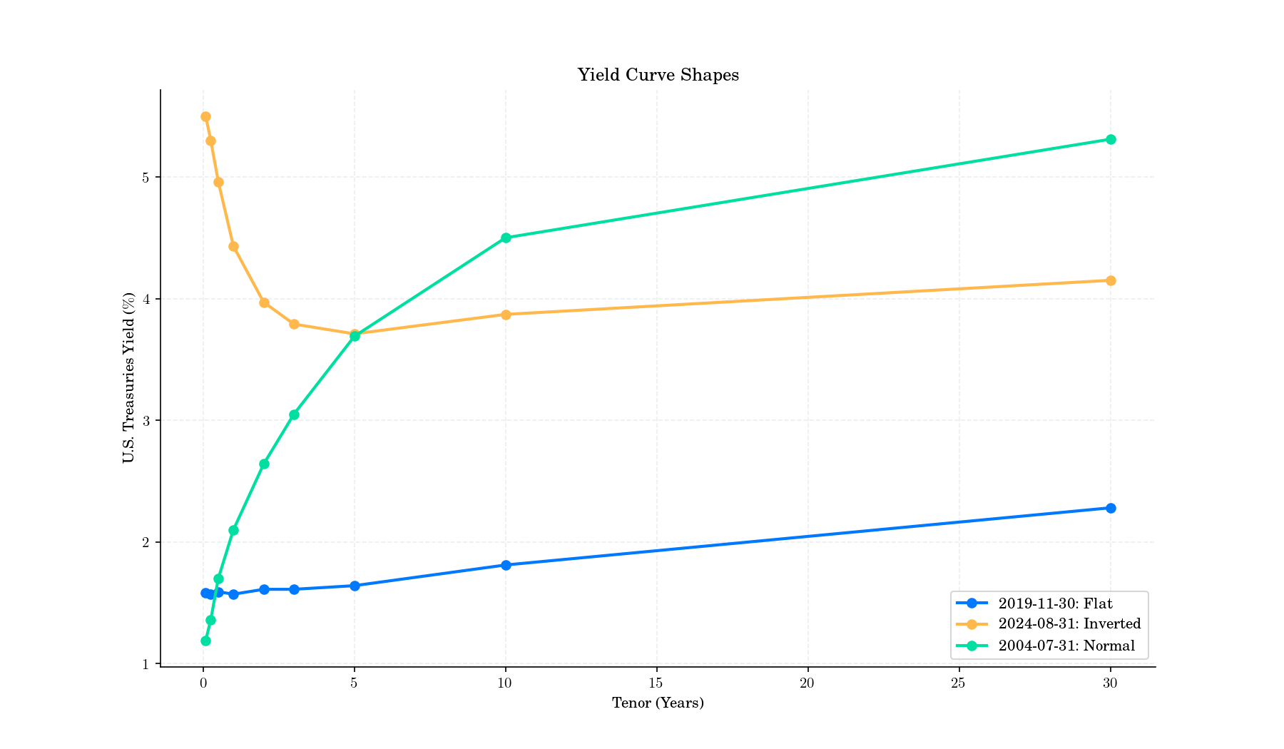
Yied Curve Shapes#
# Author: Dialid Santiago <d.santiago@outlook.com>
# License: MIT
# Description: Advent Calendar Day 3

import matplotlib.pyplot as plt
import numpy as np
import pandas as pd

plt.style.use(
    "https://raw.githubusercontent.com/quantgirluk/matplotlib-stylesheets/main/quant-pastel-light.mplstyle")

tenors = [
    '30-year',
    '10-year',
    '5-year',
    '3-year',
    '2-year',
    '1-year',
    '6-month',
    '3-month',
    '1-month',
]

tenor_years = [30, 10, 5, 3, 2, 1, 0.5, 0.25, 1/12]

# Dictionary of yield curve cases with date and yields
yield_curves = {
    'normal': {
        'date': '2004-07-31',
        'yields': [5.31,4.5,3.69,3.05,2.64,2.1,1.7,1.36,1.19]
    },
    'inverted': {
        'date': '2024-08-31',
        'yields': [4.15, 3.87, 3.71, 3.79,3.97,4.43,4.96,5.3,5.5]
    },
    'flat': {
        'date': '2019-11-30',
        'yields': [2.28, 1.81, 1.64, 1.61, 1.61, 1.57, 1.59, 1.57, 1.58]
    }
}

df_all = []
for case_name, case_data in yield_curves.items():
    df_case = pd.DataFrame({
        'case': case_name,
        'date': case_data['date'],
        'tenor': tenors,
        'yield': case_data['yields'],
        'tenor_years': tenor_years
    })
    df_all.append(df_case)

df_yield = pd.concat(df_all, ignore_index=True)


fig, ax = plt.subplots(figsize=(12, 7), dpi=150)
for case_name, group in df_yield.groupby('case'):
    ax.plot(group['tenor_years'], group['yield'], marker='o',
            label=f"{group['date'].iloc[0]}: {case_name.capitalize()} ", linewidth=2)
ax.set_xlabel("Tenor (Years)")
ax.set_ylabel("U.S. Treasuries Yield ($\\%$)")
ax.set_title("Yield Curve Shapes")
ax.legend()
ax.grid(alpha=0.3)
plt.show()
Total running time of the script: (0 minutes 1.024 seconds)